This article is part of the ISC’s new series, Transform21, which will explore the state of knowledge and action, five years on from the Paris Agreement and in a pivotal year for action on sustainable development. This piece was first published by The Washington Post/Capital Weather Gang and Climate Central.
Speed kills.
That’s why firing bullets from a gun is more dangerous than tossing them by hand. Why skydivers use parachutes. Why roads have speed limits. And why it’s critical to understand how quickly human activity will drive the climate to change, compared to past rates. Will we cause gradual shifts that civilization and life on Earth can adapt to—or are we igniting a wildfire that can’t be outrun?
And so it is that scientists trek to frigid Antarctica, to drill deep into its ice sheets and pull out thousands of feet of snow compressed into ice. They carefully date each layer, extract tiny bubbles of ancient atmosphere, and measure the concentration of carbon dioxide, tuner of the planet’s thermostat.
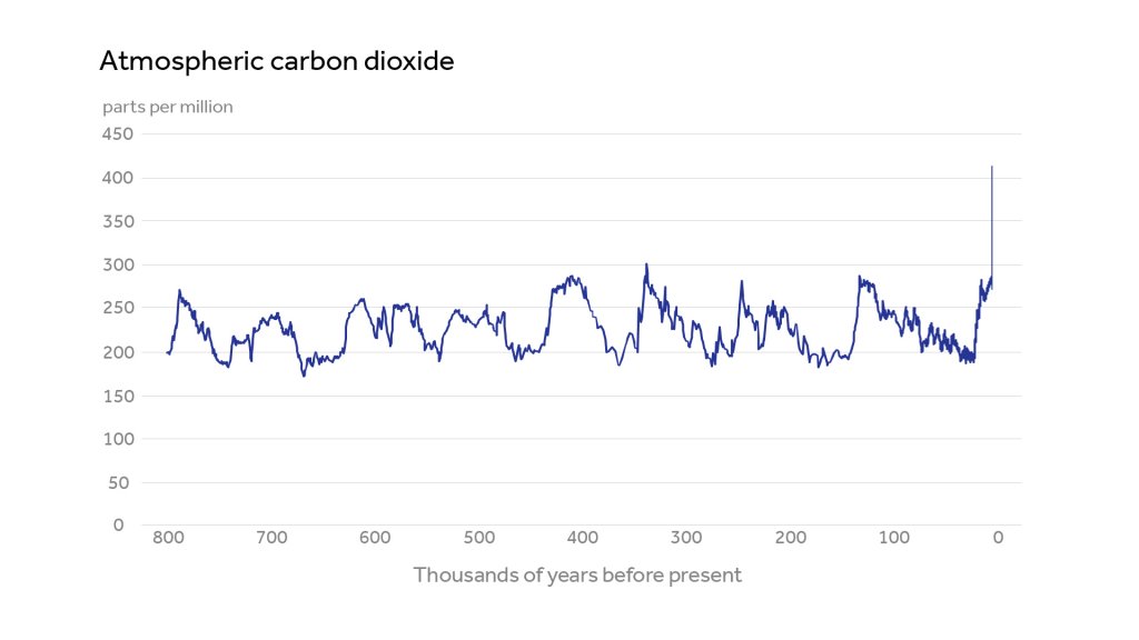
From this hard work, we’ve learned the sawtooth pattern of carbon levels over the past million years. It has shot swiftly up during climbs to past warm intervals a bit like the climate of today, and ramped slowly down into the long ice ages in between them. We can also see the sharp recent increase in carbon dioxide that humans have caused, mainly by burning fossil fuels for energy. The graph used to show this jump is arguably the most iconic figure in climate science.
To me, it’s long been the most powerful illustration of climate change’s danger. At a glance, it shows how huge a departure we’ve made from normal. Yet there’s a built-in optical illusion that greatly understates human influence.
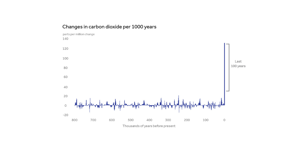
Simply put, there’s a lot of time squished between the left and right ends of the plot—almost a million years. The eye can hardly tell the difference between the tiny widths occupied by one hundred versus one thousand years. While the most recent jump in carbon is clearly the tallest and steepest, it doesn’t look that much steeper than many increases that came before it.
But the recent increase is in fact way steeper than any past jump in this record or yet discovered. Steepness is what shows the speed of carbon increase—and speed foretells danger. The faster the climate changes, the less ability society has, along with the ecosystems we depend on, to adapt to the new abnormal.
You can begin to see the difference by zooming in to look at only a small recent fraction of the figure’s timeline. New data from Antarctica have just given us our highest-resolution look yet of carbon dioxide during the last 67,000 years:
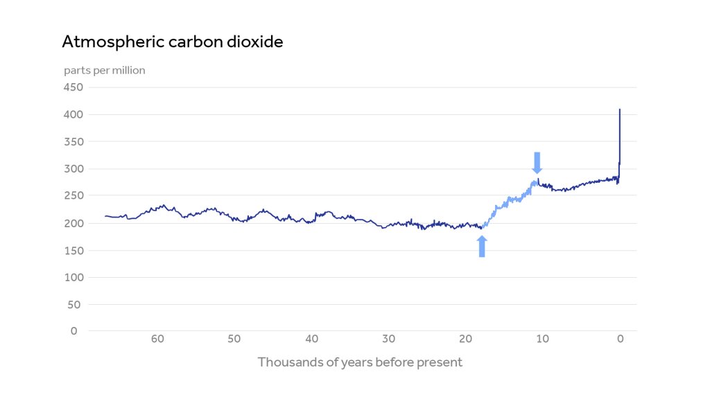
Within that period, you can see the slow decline of carbon until Earth reached the coldest point of the last ice age, about 20,000 years ago. Then, for seven to eight thousand years (the period between the arrows), carbon naturally shot up, warming the planet to near its current climate—hospitable for agriculture and civilization.
The sheer spike at the far right, linked to human activity since the Industrial Revolution, is obviously much steeper. The problem is that we needed to zoom way in to see this contrast—but have to zoom way out, like the first figure, for the broader context.
Fortunately, there is a simple way to show the difference in speed of change together with a very long record. That way is to focus on the change in carbon dioxide per period of time, instead of on the level. The result reveals the jaw-dropping carbon skyscraper at the top of this piece.
To my knowledge, this is the first time that the historic carbon record has been depicted in this way. My hope in developing this visualization is to clearly show just how dramatic the human influence has been—and how grave our situation may be.
Importantly, there is an optimistic side to this coin as well. The speed and scale of human industry can also be applied toward solutions, and today, we have the potential to move quickly to reduce emissions. Through renewable energy and other clean technologies, and with smart policy and the will to act, the world’s nations can shut the carbon floodgates much more swiftly than we pried them open—in a few decades, not centuries.
Perhaps the skyscraper plot hasn’t been tried before because we don’t have direct carbon dioxide readings for the exact years needed. There are gaps in the record: for the whole period shown, scientists have direct measurements once per 400 years or so on average—and about once per 800 years in the older parts of the timeline. Some gaps exceed 2,000 years. The reason the traditional graph looks complete is that a line is drawn between observations, essentially connecting the dots. But from a scientific perspective, that’s not the best way to fill in the gaps.
To improve on that approach, my colleague Scott Kulp used neural networks, a form of artificial intelligence, to construct a continuous curve from the patchy data, shown just below, and allow estimates for any year. The carbon skyscraper is constructed by taking readings from the curve every 1,000 years going back from the present.
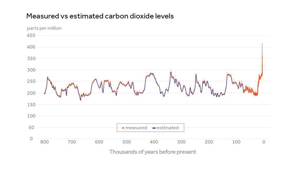
The reconstructed curve has a good fit to the data. But the 1,000-year skyscraper still understates our predicament.
Why? Time chunks 1,000 years long can’t capture the speed of the modern carbon jump, almost all of which has taken place in the last century. If we could make a 100-year skyscraper plot, its appearance would be even more stark. It would look a lot like the 1,000-year skyscraper, but with the average change per period—except the last spike—divided by ten, creating an even bigger contrast. Unfortunately, data gaps across most of the record are still too long to put confidence in a reconstruction with a 100-year resolution. Or maybe that is fortunate: the 1,000-year version looks daunting enough.
One thing is clear at any resolution: humankind is on a crash course with rapid, destabilizing climate changes, unless we can dramatically slow down and stop our pollution of the atmosphere. After that, maybe we can even find a way to put it in reverse.
Detailed method for estimating CO2 levels in past years without data
Developed and implemented by Scott Kulp, Ph.D., Senior Computational Scientist, Climate Central
For raw data on past CO2 concentrations, we used the Antarctic Ice Cores Revised 800KYr CO2 Data (Bereiter et al. 2015) from the World Data Center for Paleoclimatology, Boulder and the NOAA Paleoclimatology Program, accessed in May 2020. For the period from 8,877 – 67,257 years before present (2020), we swapped in more recent data from the WAIS Divide Ice Core Marine Isotope Stage 3 CO2 record (Brook 2020) at the US Antarctic Program Data Center.
To predict CO2 concentration based on year, in order to fill in years missing from the direct record, we built a multilayer perceptron artificial neural network, trained on observations based on Antarctic ice sheet core samples from present-day to 800,000 years BP. There are 1952 such observations, though they are not evenly distributed, with more than half representing points before 100,000 BP.
Neural networks are commonly used for highly nonlinear regression analyses, such as this one. Our neural network contains 4 layers: a 1-node input layer (taking the year as a single input), two hidden layers with 100 and 10 nodes, respectively, and a 1-node output layer (the predicted CO2 concentration). The model was trained using Matlab’s Deep Learning Toolbox, employing the Levenberg-Marquardt backpropagation function. 1854 of the samples were randomly chosen to be used as the training set, 49 were used for the validation set, and the remaining 49 were used as the testing set. The training ran until predictions made with the validation set worsened over 6 consecutive epochs, with the final bias at 0.0025 and root mean square error at 4.0 parts per million (ppm) for the training set, and 0.46/4.19 ppm for the independent testing set. These strong and similar performances between the training and testing sets indicate that the model did not strongly overfit.
We then queried the model to get CO2 level estimates at 1,000 through 800,000 years before present (taken as 2019) at 1,000-year intervals, and used 409 ppm as the present level. The global average was 411 ppm in 2019, but CO2 levels over Antarctica run roughly 2 ppm lower than the global average, so we made an adjustment to account for the fact that the ice core CO2 levels come from Antarctica. Finally, we took differences to compute the change in CO2 for each 1,000 years.

Benjamin Strauss
CEO and Chief Scientist, Climate Central
Dr. Benjamin Strauss was elected President and CEO of Climate Central in April 2018 and also serves as Chief Scientist. He is author of numerous scientific papers and reports on sea-level rise and is architect of the Surging Seas suite of maps, tools and visualizations.
See the Climate Central website for a full biography and selected publications.
 Read more about New UNEP-ISC Report: As global crises join forces, world must adopt forward-looking approach to protect human and planetary health
 Read more about What we learned about social transformations to sustainability from a decade of transdisciplinary research
 Read more about Enhancing disaster preparedness: User feedback drives improvements to UNDRR-ISC Hazard Information Profiles