This article is part of the ISC’s Transform21 series, which features resources from our network of scientists and change-makers to help inform the urgent transformations needed to achieve climate and biodiversity goals.
Over the last year or so, many people across the world have become used to seeing charts and graphs with COVID-19 statistics in their news feeds, but all charts are not created equal when it comes to effectively communicating a key message.
Researchers have been examining how different aspects of data presentation influence audiences for many years. They have looked at the issue from diverse angles such as which components are viewed in what order and why, and whether text, graphs or maps are more engaging and easily understood. These diverse research questions have been addressed using a wide variety of methods ranging from tracking audience eye movements to surveys and social media polls. From this collection of research, we have gained valuable insights that can help make data visuals more effective communication tools.
A useful framework to think about when designing data visualisations follows the broad process of audience interaction with the presented information: (a) first the audience perceives the information (b) then they think about the information, and (c) then some sort of change or impact occurs due to those thoughts.
Assuming that your data visualisation is presented to your target audience in a time and place where they are likely to see it, your audience needs to be able to perceive and differentiate each of the key components of your visualisation in order to discern its meaning.
Perception tends to happen in sequence, following a visual hierarchy of attention based on the following characteristics of any object (including maps and graphs): size, colour, contrast, alignment, repetition, proximity, whitespace, and texture and styles. Within each of these elements are further sub-hierarchies. For example, people tend to notice large elements before smaller ones, and bright colours before muted ones. Similarly, dramatic contrasting components are noticed more than those with less contrast.
The effect of these hierarchical elements can be impacted by perception challenges and should be carefully considered to ensure that they promote your message rather than confusing or distracting your audience. There are a range of different perception challenges that can impact on the effectiveness of data visualisations, but did you know there are actually seven different forms of colour blindness? You can even run your data visualisation through a colour blindness simulator to see how it might be viewed by someone with these challenges.
When your audience thinks about and derives meaning from information they perceive, this is known as cognitive processing. It includes thinking, knowing, remembering, judging, and problem-solving; any number of which may be used when processing information associated with visualised data.
Some things you can do to help encourage the desired interpretation of meaning from your data visualisation include providing chart titles that are the main message rather than just a description of the content. A title such as ‘Higher amounts of green vegetation in cities is associated with lower summer temperatures’ is much more effective at guiding meaning-making than titling the same chart as ‘Green vegetation and temperature in Australian cities’.
Some topic areas that may require data visualisations can also have underlying psycho-social (psychological, social and/or political) factors that should be considered. This is particularly the case for climate change, a heavily politicised issue that is quite polarising in some countries. When presenting data relating to climate change, some valuable tips include:
It’s also important to recognize that people are generally more likely to remember meaning than detail. This means that people are more likely to remember a trend—such as it’s getting ‘worse’ or ‘better’, ‘increasing’ or ‘decreasing’—but may not remember the specific amount or rate of that increase or decrease.
There are a range of possible impacts that might arise from audiences viewing your data visualisation. These could be changes in thought (for example, awareness, understanding, attitudes or concern), or changes in behaviour (for example, information seeking, discussion with others, or even adoption of climate-friendly behaviours). The likelihood of change being effected due to your data visualisation will be enhanced by ensuring your messages are clear and relevant, where clarity will come from effectively addressing perception and cognition considerations and relevance will come from appropriate message framing and consideration of psycho-social factors. Knowing the kind of change you want to achieve will be critical in determining how best to integrate these various factors into your work.
While most people wishing to present complex scientific data tend to think of charts, graphs, maps, and infographics, it is also possible to present information for perception by other senses such as through sound. Some researchers have been testing data sonification as an alternative to visual data representation. Sonification takes each data point and applies a mix of sound elements that can allow trends to be distinguished—for example, pitch, volume, and choice of instrument—to provide an audio representation of the information. NASA has done this so that people can ‘listen’ to the Milky Way Galaxy, and researchers at the Monash University Climate Change Communication Research Hub have sonified cyclone Debbie’s movements around Australia in 2017.

A free best practice guide has been developed based on a review of data visualisation research. Hopefully, it will help you decide how you can best present your data for effective perception, cognition and impact. You can access the Best practice data visualisation: Guidelines and case study on the Monash Climate Change Communication Research Hub website.
Lucy Richardson
Dr Lucy Richardson is based at the Monash Climate Change Communication Research Hub, Monash University, on the lands of the Kulin Nations, Melbourne, Australia, and a member of the Commonwealth Futures Climate Research Cohort established by The Association of Commonwealth Universities and the British Council to support 26 rising-star researchers to bring local knowledge to a global stage in the lead-up to COP26.
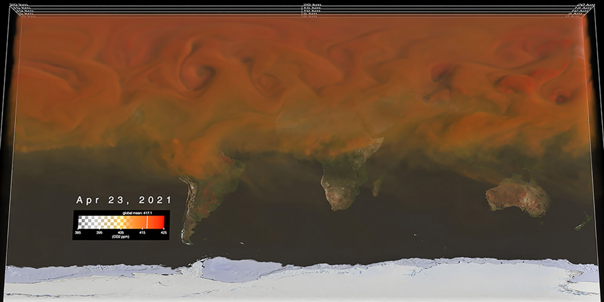
The header image was created by NASA’s Scientific Visualization Studio to support a series of talks from NASA scientists for COP26. It is a still from a video that shows the atmosphere in three dimensions and highlights the accumulation of CO2 during a single calendar year. You can watch the visualisation and find out more about the data on which it’s based here.
 Read more about WorldFAIR: Continuing to transform data to tackle complex challenges in a follow-up project
 Read more about New UNEP-ISC Report: As global crises join forces, world must adopt forward-looking approach to protect human and planetary health
 Read more about What we learned about social transformations to sustainability from a decade of transdisciplinary research